Maximizing Image Viewing Efficiency: How Visual Sorting Can Help
TLDR: In January 2022, we – the Visual Computing Group at HTW Berlin – conducted an experiment to evaluate image sorting. It was shown that images in sorted arrangements are found much more quickly. Our new measure for evaluating image sorting proved to be significantly better than those usually used to describe the perceived sorting quality by humans. Additionally, our proposed sorting methods were able to generate high-quality image sorting much more efficiently compared to other methods.
More than 2000 participants took part in our experiment, and we would like to thank them again here. The published article (https://onlinelibrary.wiley.com/doi/epdf/10.1111/cgf.14718) on the results of the experiment may be difficult to understand for non-specialists. Therefore, we will attempt to summarize the motivation, implementation, and results of the experiment in an understandable way here.
Hier gibt es den Text auch auf deutsch.
People have difficulty recognizing many images at once
Although humans can quickly perceive and understand complex images, they have difficulty recognizing many images at once. This problem arises when searching for images in photo archives or products on e-commerce websites. In such cases, the search is often very difficult when the number of relevant images is very large. Since only 10-20 images can be perceived at once on a screen, endless scrolling through unstructured lists is often necessary to find the desired image or product.
Humans can perceive images more easily when they are displayed in a sorted order. The following image shows 256 IKEA kitchenware items, on the left side in a random order and on the right side sorted by similarity. When searching for a specific image, in the unsorted case, the only option is to “scan” the images row by row. In the sorted arrangement, the appropriate region can be quickly identified, and the search can be focused on that area.
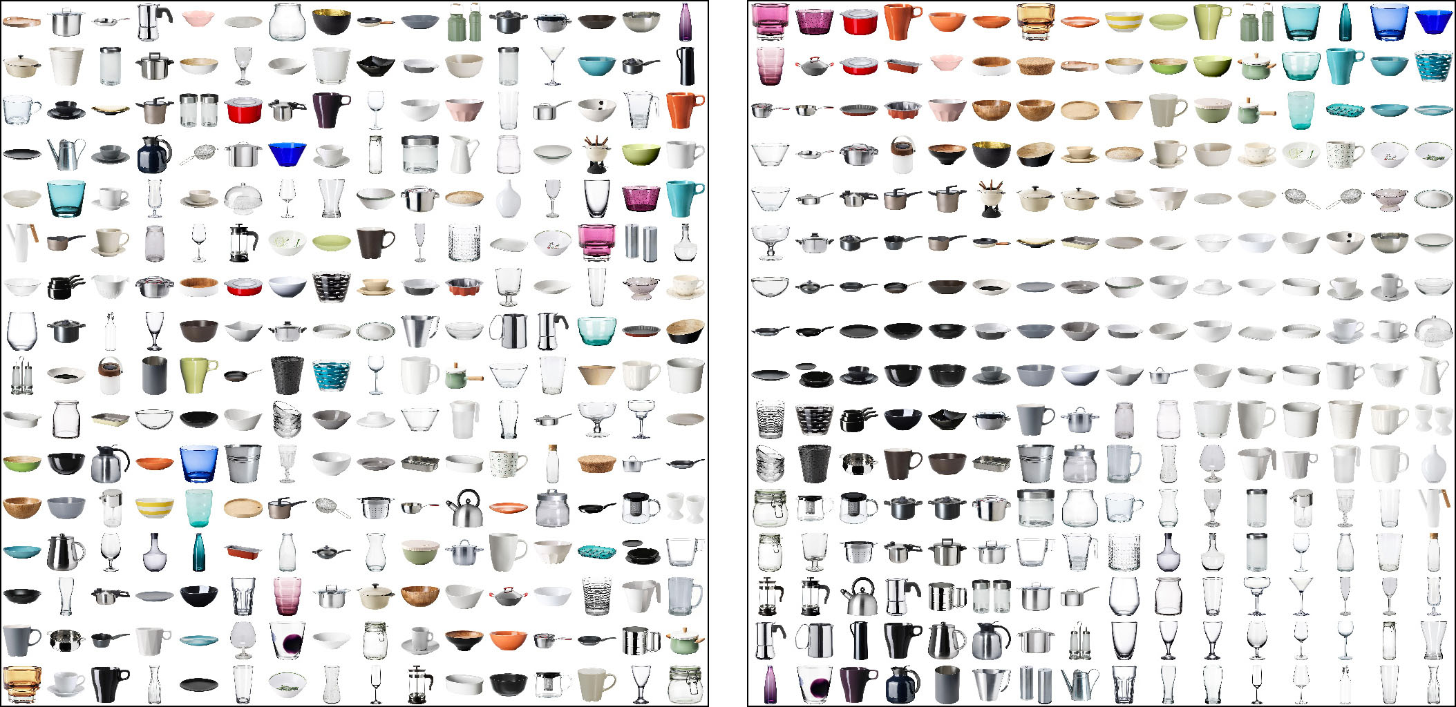
256 IKEA kitchenware items, on the left: in random order and on the right: sorted by similarity.
Goals of the Experiment
The goal of the conducted experiment was to determine to what extent people are able to perceive more images at once through suitable sorting of images, and how this can reduce the time it takes to find the images. Specifically, the following questions were addressed:
- Which types of image sorting do people perceive as pleasant and helpful?
- How can the quality of a visual sorting, as perceived by people, be objectively measured?
- Which methods are best suited to efficiently create sorted arrangements that match people’s preferences?
What does “sorting” actually mean?
Before presenting the answers obtained in the experiment to the questions mentioned above, we would like to explain the principle of sorting using a simple example. If the numbers 6, 5, 2, 8, and 3 are to be sorted according to their size, this means that we have to arrange the numbers in such a way that each number is larger than the previous one.
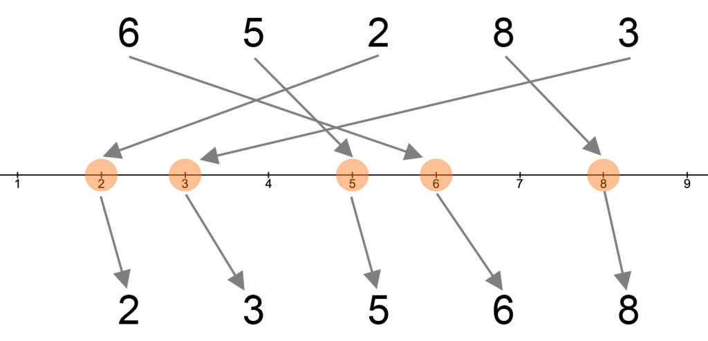
Sorting of five numbers
In general, there are 1∙2∙3 ∙ … ∙ n = n! (read “n factorial”) ways to arrange n objects. In the case of our five numbers, there would already be 120 possible arrangements, of which only two are sorted (ascending or descending). For larger sets of numbers, there are efficient algorithms for determining the sorting (the optimal arrangement).
How to sort images?
When it comes to sorting images, it is not clear what a good sorting actually looks like or how to determine it. Compared to sorting numbers, there are two main differences: Firstly, the appearance and content of images are not described by individual numbers, but rather by so-called feature vectors. This means that each image is represented by a vector in a high-dimensional space, with vectors of similar images usually located close to each other. Secondly, the sorted images are usually arranged on a 2D grid, which means that there are neighbors in both horizontal and vertical directions. The number of possible arrangements again grows factorially with the number of images. For an arrangement of 100 images on a 10×10 grid, there are already 100! = 9.3∙10157 possibilities (a number with 158 digits) to arrange them. Given such a large number, it is even impossible for the fastest computers to try out all variants. Even if it were possible to compare all arrangements, it would not be clear which one is best sorted.
To illustrate the principle of sorting images, the two-dimensional sorting of colors can serve as an example. Colors are described by their red, green, and blue components and can thus be represented as 3D vectors. To sort colors two-dimensionally, these 3D vectors must be assigned a position on a 2D grid. The following figure shows a sorted arrangement of 9 ∙ 9 ∙ 9 (= 729) RGB colors on a 2D grid with 27 ∙ 27 (= 729) positions.
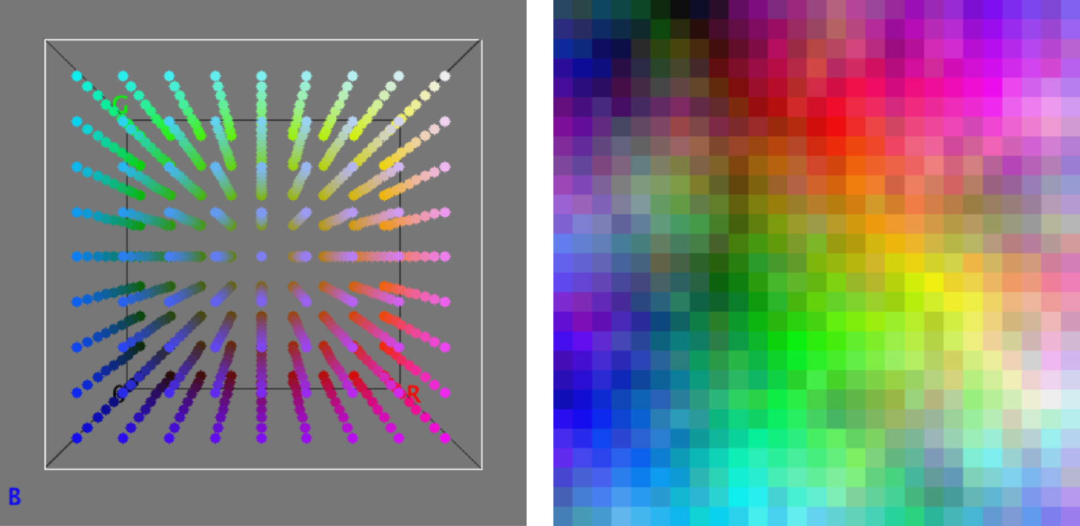
729 colors in the 3D RGB color space ➞ 729 colors arranged on a 2D grid.
The difference between the visual sorting of images compared to the color example mentioned above is only that the dimensions of the feature vectors of images are much higher. Less than 100 dimensions are sufficient to describe the visual appearance of an image, while thousands of dimensions may be required to describe the content of the image. The sorting process then tries to position similar images close to each other. If you want to know how the algorithms for sorting images actually work, you can read about it in our paper.
Used image sets
Before conducting the experiment, we performed tests with various image sets of different sizes. It turned out that with too many images, some of them were very difficult to find regardless of their sorting. This would certainly have led to the termination of many participants during the search tasks in the experiment. On the other hand, with very small sets, the sorting of the images had little influence on the search time, as the desired images were usually recognized and found immediately.
In the experiment, four different sets were used. The first consisted of 1024 randomly generated RGB colors and was only used to determine the perceived quality of different sorting methods. For three other image sets, the time to find the desired images was also recorded. These three sets were chosen in such a way that they represent different search scenarios on the one hand, and there was still a significant difference in search speed between sorted and random arrangements on the other. The first set consisted of 169 traffic signs as they could be depicted on overview boards. The second set were 256 images of IKEA kitchenware items, as they are typically presented on e-commerce websites. The last set was made up of 400 images for 70 unrelated search terms that were crawled from the internet. This set could represent personal photos. The following figure shows the four used sets, each sorted according to the best evaluation by the participants.
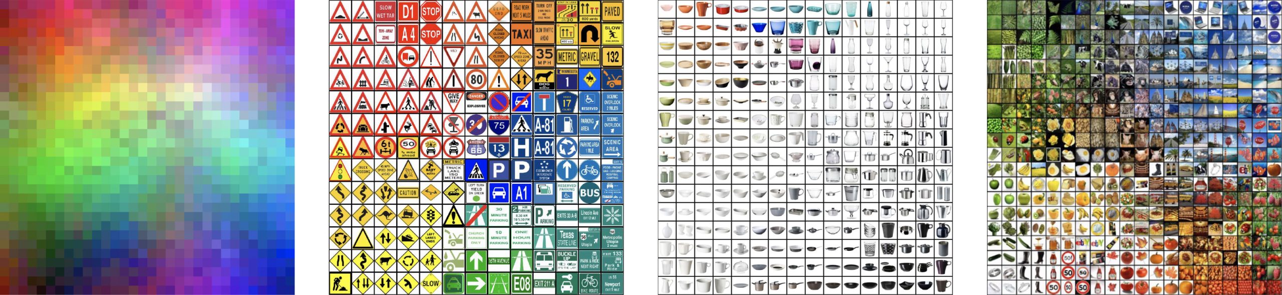
The four test sets of the experiment: 1024 RGB colors, 169 traffic signs, 256 kitchenware items and 400 images for 70 search terms from the Internet
Implementation of the experiment
The experiment consisted of two parts. In the first part, participants’ preferences were recorded by asking them to view pairs of sorted image arrangements and decide which of the two arrangements they preferred. The preferred arrangements were those that “have a clearer structure, provide a better overview, and make it easier to find searched images.” In the second part of the experiment, participants were asked to find searched images in sorted arrangements as quickly as possible. It was examined whether the sorting preferences of the participants also enable a faster search. In addition, we investigated how well search time can be predicted using the quality of the sorting.
Investigated sorting methods and quality measures
In our experiments, we used various methods to generate sorted arrangements. In addition to Self Organizing Maps (SOM), we used Self Sorting Maps (SSM), IsoMatch, and a discrete t-SNE projection. We compared these methods with our own approaches Linear Assignment Sorting (LAS) and Fast Linear Assignment Sorting (FLAS). Further details on the algorithms used for each method can be found in our aforementioned publication. Whenever possible, we generated multiple arrangements using different parameter settings for each method. To have examples of low sorting quality for comparison, some poorly sorted arrangements were also generated (designated as “low Qual.”). Random arrangements were not used as they would have led to experiment interruptions, as finding the images would have been too difficult.
There are measures for evaluating 2D arrangements, but there are no studies showing how well they reflect the perceived quality by humans. These quality measures compare the distances of the feature vectors in high dimensionality with the resulting distances of the images on the 2D grid. Typically, the cross-correlation or normalized energy function is used, but both behave similarly, so we only compared the latter. We proposed a new measure called “Distance Preservation Quality” (DPQ) for evaluating 2D arrangements.
Perceived sorting quality
The next figure shows a screenshot of the first part of the experiment. All participants were shown 16 pairs of arrangements, and they were asked to decide whether they prefer the left or the right arrangement or consider them both equivalent.
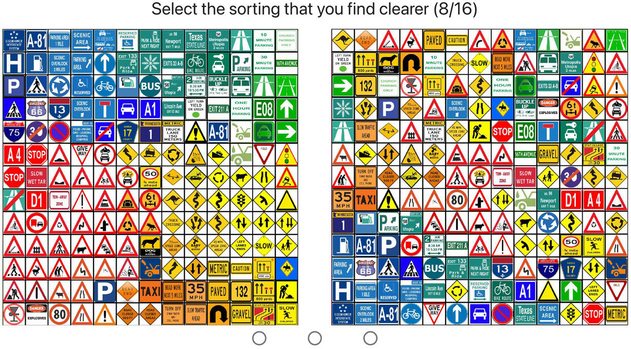
Screenshot of the first part of the experiment
To exclude potential influence of meaningless evaluations, in each experiment a pair of extremely different quality sortings was presented. If a participant preferred the significantly worse sorting in this pair, their evaluations for all the sortings were discarded. In total, 32 sortings for the color set and 23 sortings for each of the three image sets were examined. Corresponding to the German football Bundesliga, where there are 18 teams and 18∙17 = 306 games in total in a season, which corresponds to 153 different matchups, in this experiment there were 496 possible pairs for the color set and 253 possible pairs for each of the three image sets.
A similar approach to football was used to evaluate all comparisons, where a match can end with a win, a loss, or a tie. In the comparison of two sortings, the preferred sorting received one point. If both sortings were rated as equal, both received half a point. In contrast to football, where there are two games between two teams per season, each sorting pair was evaluated at least 35 times by different participants. From these evaluations, the average score for each sorting in a pairing was determined. These two scores, which add up to 1, describe the ratio in which one sorting was rated better than the other. For the overall comparison of all sortings, their received scores from all pair comparisons were added up.
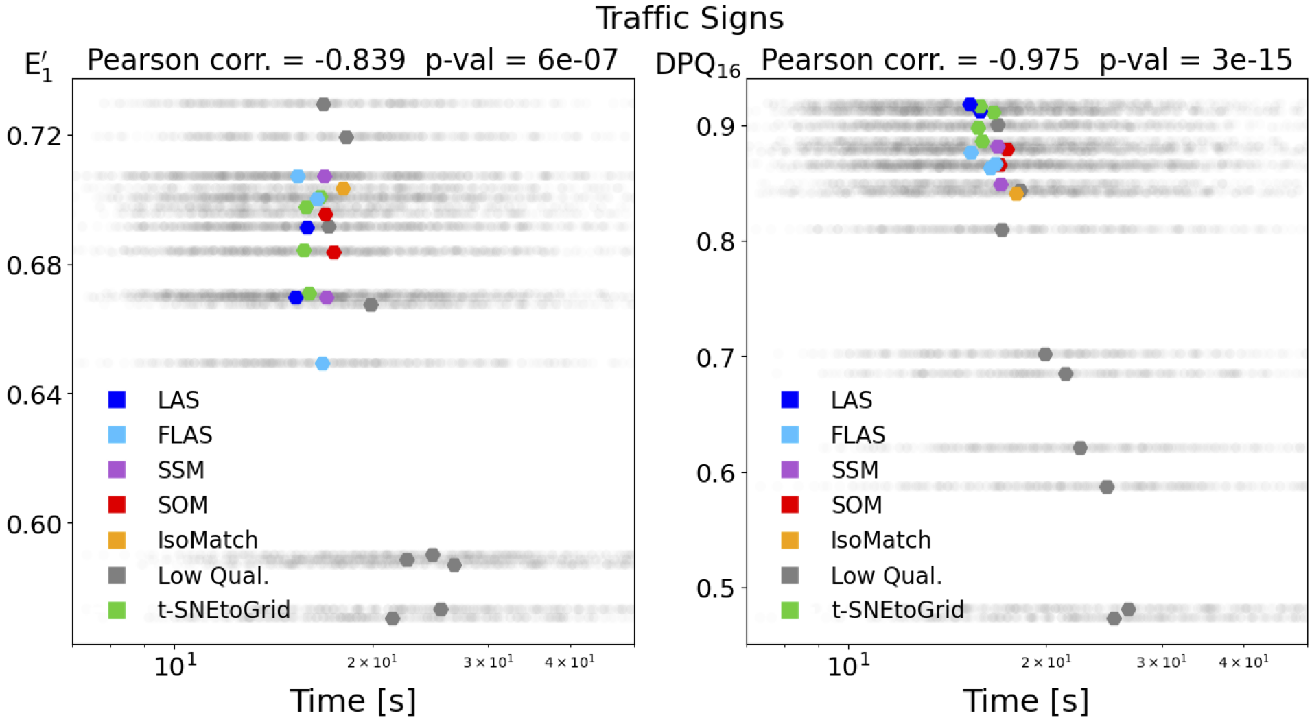
A quality measure that evaluates the sorting quality should closely correspond to the quality evaluation of users. The following figures show the correlation of the average user rating of the sortings (User Score) compared to the two quality measures investigated. Here, E’1 stands for the commonly used “normalized energy function,” and DPQ stands for the “Distance Preservation Quality” proposed by us. The symbol colors represent the different sorting methods.
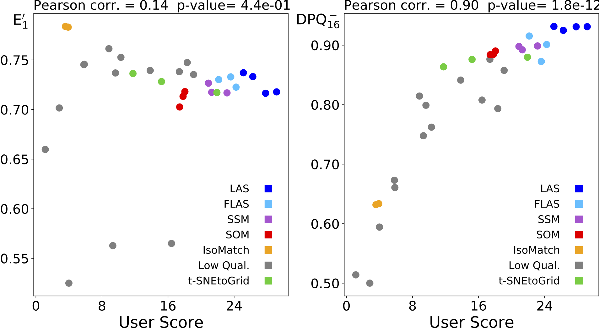
1024 RGB colors: Correlation between user ratings and normalized energy function (left) and Distance Preservation Quality (right). It can be observed that sortings that are rated higher by humans are considered worse by the “normalized energy function”. Conversely, the “Distance Preservation Quality” values (right) increase for better rated sortings.
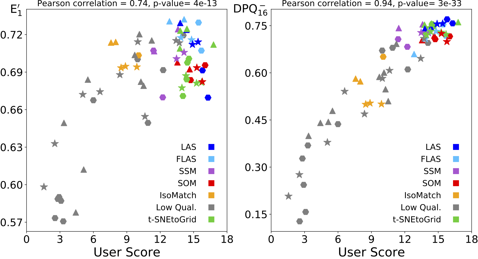
Image sets: Correlation between user ratings and normalized energy function (left) and our Distance Preservation Quality (right). The symbol shapes identify the image sets: traffic signs (⬢), kitchenware items (▲), and internet images (★).
The two figures show that our new DPQ measure has a higher correlation with user ratings, meaning that it is better suited for predicting the perceived sorting quality by humans.
Search times
In the second part of the experiment, the users were shown various sorted arrangements, in each of which four random images were to be found. Once an image was found, the next one was immediately displayed. The sortings used were the same as in the first part of the experiment.
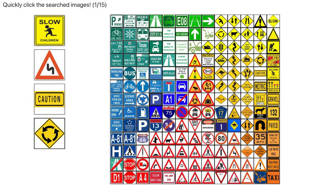
Screenshot of the second part of the experiment
Of course, the difficulty of finding images depends strongly on the images searched for, as some images are more noticeable than others. In addition, participants differ in their search abilities. With only a few trials, these two aspects could significantly distort the results. However, a total of more than 28,000 of these search tasks were performed. This means that for each sorting, more than 400 searches were performed for four images each. This high number compensated for both the varying difficulty of the search tasks and the unequal abilities of the participants.
The next figures show the distribution of search times for the 23 different sortings for the set of traffic signs and Internet images (Web Images). The median values of the search times for the different sortings are shown as colored markers. Again, this shows the stronger (negative) correlation of the search times with our DPQ measure compared to the normalized energy function.
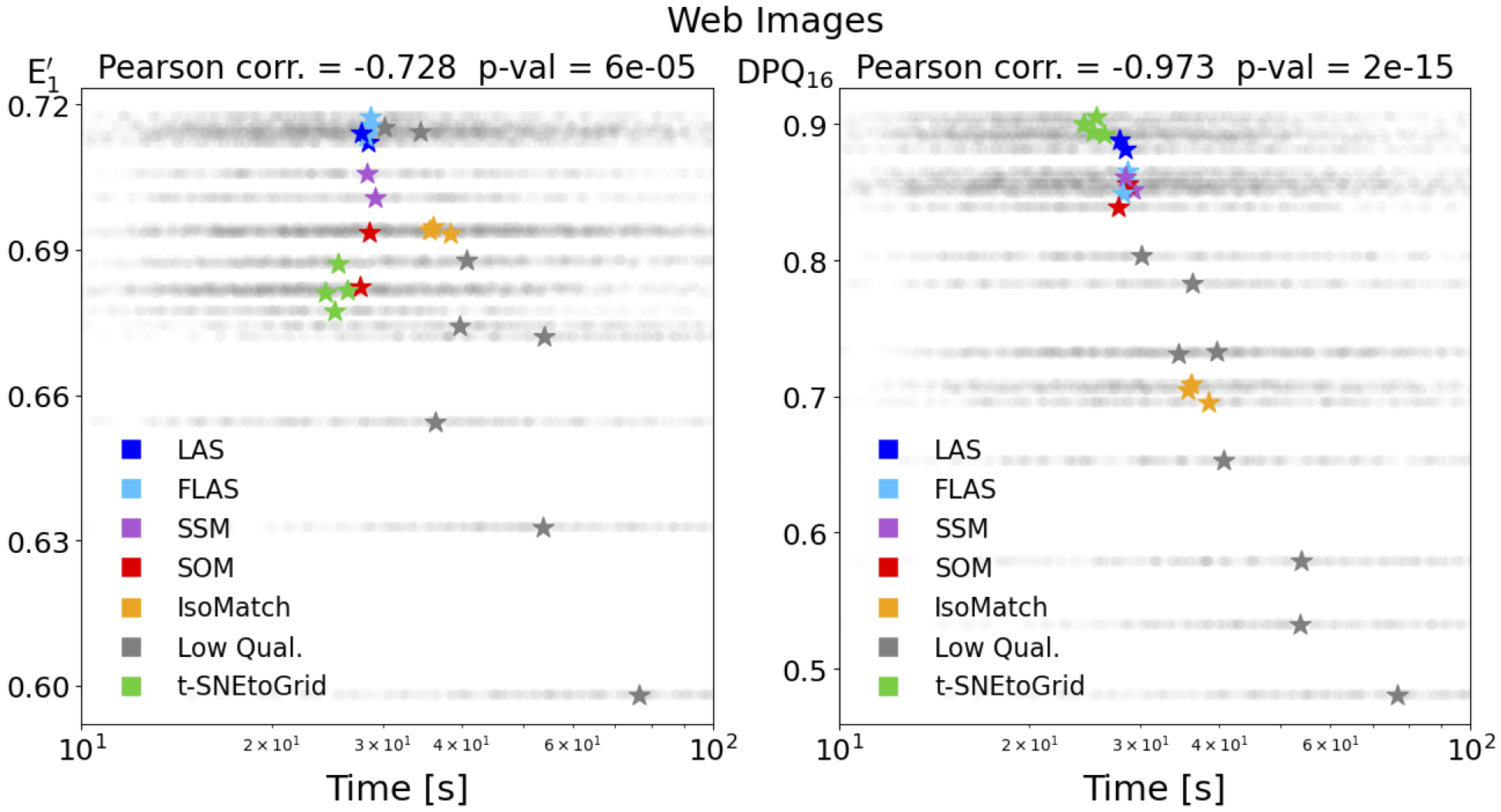
Correlation of median search times with normalized energy function (left) and our Distance Preservation Quality (right).
When comparing the sortings that enable fast searching with those that were rated highly, a strong agreement was also observed. However, for quick searching, it was more important that all similar images were arranged very close to each other, even if the global arrangement of the sorting was rated slightly worse as a result. The next figure on the left shows the sorting that was rated the highest for the Web Images set, and on the right is the sorting where the images were found the fastest. On the left, the transitions are smoother, while on the right, all related images are close together, resulting in some hard transitions.
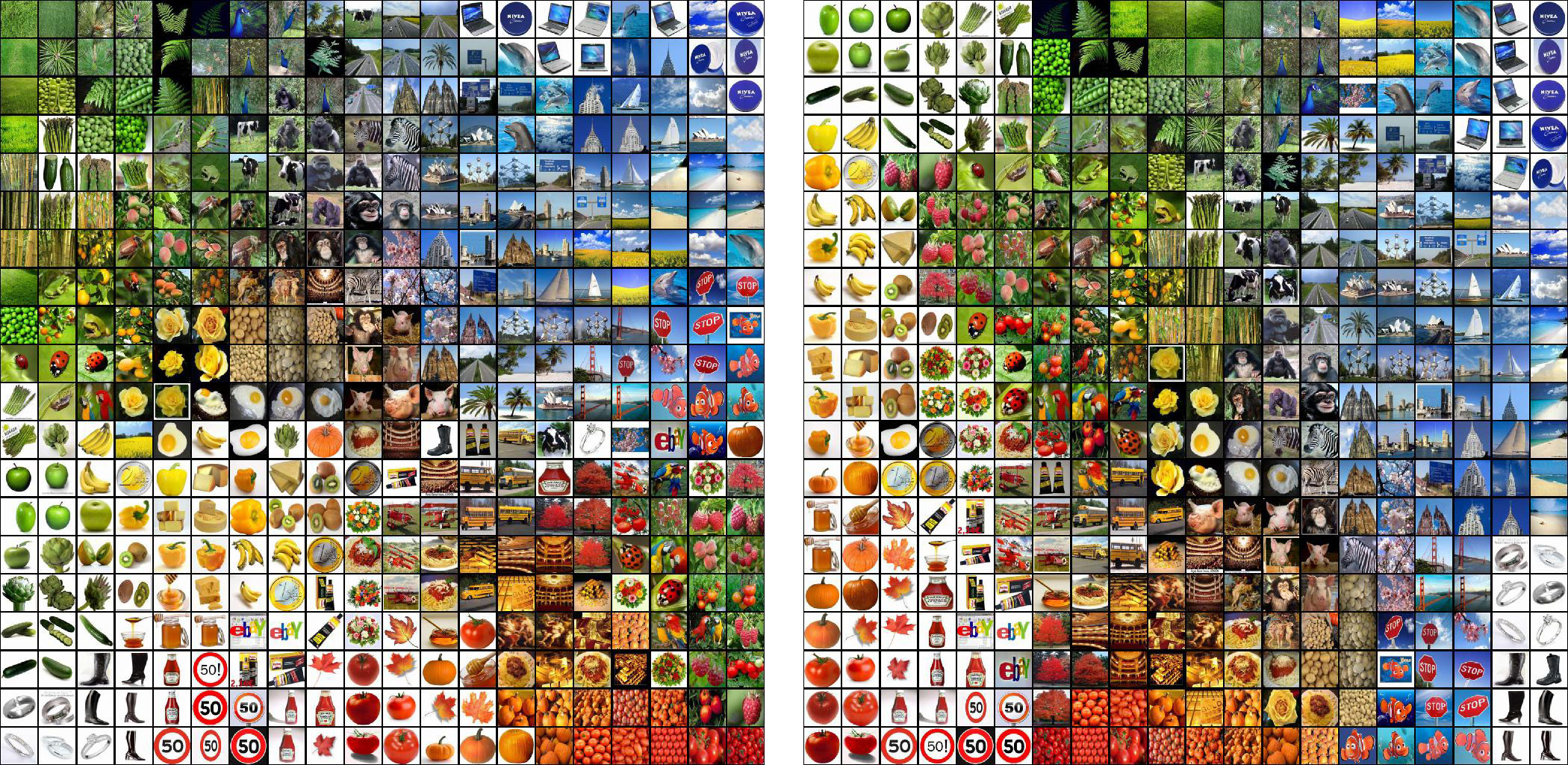
Left: the sorting that was rated the best; right: the sorting in which the searched images were found the fastest.
Comparison of sorting methods
The final step was to gain a better understanding of the performance of different sorting methods. Since the runtime strongly depends on hardware, the given times serve only as reference values. Since the Distance Preservation Quality has a high correlation with user preferences, it was used to compare the sorting quality of the algorithms depending on the required computation time.
The next figure shows the achieved sorting quality versus the required computation time for the investigated methods while varying the method parameters. For smaller datasets like the 256 kitchenware images, our FLAS method offers the best compromise between quality and computation time. LAS and t-SNE can deliver slightly higher qualities but are 10 to 100 times slower. For the 1024 random RGB colors, our LAS and FLAS methods achieved the highest sorting qualities.
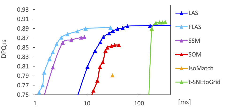
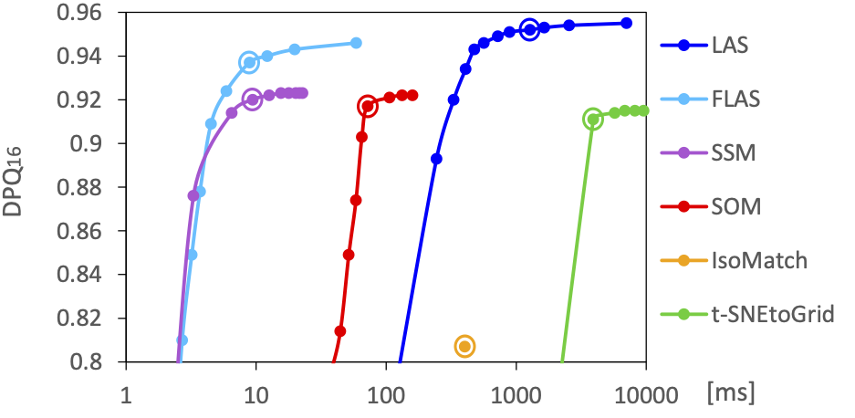
Mean sorting quality (DPQ) compared to mean runtime for different parameter settings for the sortings of 256 kitchenware images (top) and 1024 RGB colors (bottom).
Another investigation was to examine how quality and computation time behave for differently sized image sets. The parameter settings marked with ⦿ in the previous figure were chosen for this purpose. While SOM, SSM, LAS, and FLAS can generate better sorting for more images, the sorting for t-SNE and IsoMatch became worse.
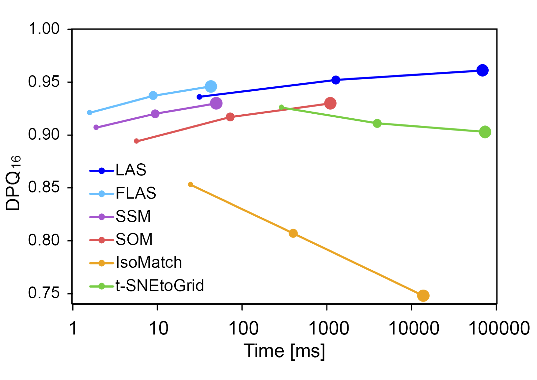
The mean achieved sorting quality as a function of the required computation time for 256 (⚈), 1024 (⚈), and 4096 (⚈) RGB random colors for the different sorting methods.
Results of the Experiment
Overall, we were very satisfied with the results of the experiment, as the previously posed questions could be clearly answered. It has been shown that humans can find images significantly faster in sorted arrangements. When analyzing image sorting that people find pleasant and helpful, it was found that high local similarity of neighboring images is more important than globally maintaining the similarity relationships of all images. Furthermore, our proposal for a new quality evaluation of image sorting was significantly better than previous methods in reflecting the quality perceived by humans.
It became clear that our proposed sorting methods LAS and FLAS can produce high-quality sorting and FLAS is also very efficient. In addition, our methods offer a variety of options to influence the sorting, such as fixed positioning of certain images or the ability to use layouts other than rectangular. The FLAS method (together with an image graph) is so fast that it becomes possible to visually explore millions of images. Navigu.net is an example of such a visual image exploration tool.
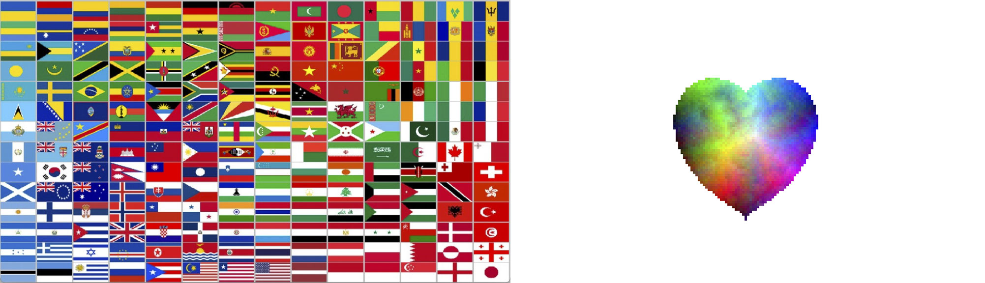
Left: Sorted flags with the American flag fixed in the bottom center position.
Right: 2404 RGB colors sorted in the shape of a heart.